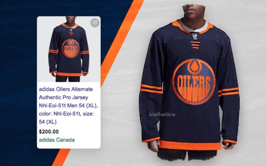
According to Dave Waddell, a CBC Radio guy based in Calgary, the new third jerseys the Oilers will use next season have been leaked. Waddell saw this jersey through a Google search of “oilers third jersey” that brought up a sponsored link from Adidas.
Here's the sponsored shopping link that comes up when you google "oilers third jersey". Not available when you click through but the unveiling has to be close… @icethetics @oilersyyc #yeg #Oilers pic.twitter.com/AcyKiPXMj6
— Dave Waddell (@dave_waddell) August 10, 2019
The new design, if this ends up being real, is much different than anything we expected to see from the Oilers. When the league went with the Adidas re-design back in 2017, the Oilers rolled with the orange jerseys as their home outfit, scrapping the royal blue outfit they had used in previous years. The team experimented with using the royal blue again as a throwback series four times last season and it was met with an overwhelmingly positive response.
Rather than looking to the past, the Oilers seem to be going in a totally new direction with these uniforms. The dark blue body is somewhat similar to what they used back in the 90s and 2000s, but this jersey features a more aggressive orange logo, which sticks with the overall orange aesthetic the Oilers are going with.
A handful of teams introduced third jerseys with Adidas last season and this leaked Oilers re-design is in line with other looks from around the league. These jerseys are all focusing on have a sleek look with one or two colours really popping out. As I said above, the Oilers seem to really be leaning into orange as their colour.
I’m personally a big fan of the Oilers’ royal blue jersey and would be disappointed with the team removing those from their rotation. As I’ve stated before when writing about jerseys, I’m a more the merrier type. If the Oilers use this new-look style as their alternates, maintain their current home and away jerseys, I figure they should still use the royal blue jerseys a few times a year as their throwback uniform.
What say you, Nation? How do you feel about these leaked jerseys? Like them? Hate them?
I like it
Orange front Logo, just like the original “Alberta Oilers” jersey in the NHL.
Nice.
I suppose… if you squinted really hard.
But that Oiler logo sucked too!
I want to see these with the numbers, pants, and the captain patches before I say anything
Gonna get trashed for this, but I gotta admit…the more I look at it the less I hate it. Still reminds me of a practice jersey, but WAY better than the Tampa Bay 3rds, and maybe even better than Winnipeg’s. I want to see them on the ice, though. See if the colors pop a little more under the lights.
And see, this is what a lot of us sound like: I want the old jerseys, the glory day jerseys, the jerseys we won Cups with. I want Slats behind the bench and Fuhr in net. I want Gretzky in his prime, I want two-line passing, one five-minute 5-on-5 overtime, and if no one scores, it’s a tie. I want no salary cap, free agency, or entry-level contracts. I want everything the way it was, darn it, because back then we were to be feared! If we’d just change our silks, we’d be great again! WHY CAN’T IT BE LIKE IT WAS?!”
Because it can’t. But gord forbid they try something new, huh?
Whats wrong with building an identity? Last time we were in the playoffs, the “Orange Crush” was awesome.
Rocking in the original WHA orange jerseys.
And I’m not saying there’s anything wrong with the throwbacks. The WHA uniforms, the royal blues…there’s nothing bad about celebrating our history. But to just automatically dismiss anything new seems small-minded. I guess that’s my point.
Automatically dismissing something that lacks eye appeal or a shred of creative designing is not small-minded
I’d be on board with the WHA jersey, for sure. But Orange Crush is an identity if you’re living in Denver and you’re a Broncos fan. It’s not an identity if another group of fans already have that identity.
I kinda dig it, I’ve always wanted to see them try the orange Alberta Oilers logo and the dark background makes it work. I’m just having trouble warming up to the thin stripes. Makes it look kinda cheap.
I wouldn’t be so annoyed by this photo-negative third jersey if the traditional home blue (’87-’90 colours) were the standard, and those colours on our white road jerseys (like they are). But that’s not the case.
Sadly, I think the jerseys represent so much about what’s wrong with current ownership and management. The Oilers are not a fashion brand… The Oilers are a sporting institution. Honour the institution. Its history. Its successes. Its traditions. Its colours. Don’t keep changing the jerseys because you know its good for your long-term retail revenue models.
Lose these ridiculous orange home jerseys. Make home the current blue that’s on our current home jerseys. Please.
I grew up hating orange Flames and orange Philly (’85/’87 cup finals). Now I’m supposed to drink this orange kool-aid?
Gross.
Agreed!
I like it a lot other than the two sleeve stripes.
It looks like a cheap Chinese knockoff.
Looks like a cheap bootleg jersey made in some non hockey country that you’d find on a sale rack at a discount retail outlet. Me no like.
To Oilers fans, I think the only thing more disgusting than this jersey would be a Flames jersey.
I didn’t think anything could be worse than the 2007 “Star Trek” jerseys but here we are.
I personally like it… has a bit of a contemporary feel to it. The “Oil Drop” should always be the focus.Give something new and different for the emerging new fans.Dont get stuck in the “70”s… just look at all the empty seats in the CFL!
PS: Iam from the past, but see the future.
Get rid of the Orange, period. Copper and Blue was a stealth change to the original blue & orange, had class written all over it. Whoever is thinking this new colour-scheme up is really alienating a lot of would-be fans. Its hard to cheer for this team outside of Northern Alberta, even with the best player in the world. The orange jerseys have been voted the ugliest in the league on a few occasions now.
source(s)?
My favourite jersey has always been the 96/97 copper and blue that they wore to the Cup finals in ‘06. Best memories.
This is a closer fit to that jersey. Curious to see how it goes with the whole uniform. I don’t love the current orange jerseys but up close and in person they are better than what you see on TV. Curious how these will fare both close up and in action.
I hate it! And I hate that horrid orange thing they’ve been wearing the last few years.
Come to think of it, I’m no fan of any “3rd” jersey or anything other than the traditional home blues and away whites. They’re all just sponges to soak up money from fans; as if we don’t give enough already.
I’d be happy to wear my Oilers colors but I’ll be damned if I’m paying 40 bucks (or more) for some cheap piece of Chinese cotton never mind upwards of 200 for a jersey.
Put a product on the ice that’s worthy of that name and logo and then; maybe, we’ll talk.
Or at least, let me see the words “Made in Canada” on the label!
You know, you’re not in any way obligated to spend any money on the Oilers.
Can’t we use Bakersfield’s jerseys, but with the Oilers logo instead? Those look amazing!
Revolting.
Not a big fan. Its not islanders black bad but its close. Please wear the blues at home more instead of the orange ones. Or wear whites at home more.
No. Just no.
This is not gonna be a hot seller. It may get hot in the firepit though. Who gets paid to design such crap?
It’s hideous but still nicer than any jersey the Canucks have ever worn.
they somehow managed to design a jersey thats simultaneously drab and aggressively ugly, quite an impressive feat
If that main color is the dark blue Id say this sweater is OUTSTANDING. Best one yet!!
Looks like sh*t
My Gord that thing is ugly.
Just pay Mcfarlane a couple bucks to revamp his old 3rd jersey they wore in the early 2000’s. Done.
Fans complain about everything. Who gives a shart what the 3rd jerseys look like? I’d take burlap sacks with duct tape numbers and the retro full-pant CooperAlls if the team wins games when they wear them.
Doubles as a Halloween costume, safe for kids at night. Is the pumpkin head mask included?
Quite frankly, I don’t care what they are wearing. Make the playoffs. Nothing like winning wearing something to make it popular.
Meh. The two tone theme won’t age well and does nothing for me. It reminds me of the McFarlane designed “sprocket” jersey from years back… you’ll see it around for a season or two and then disappear in the back of most fan’s closets.
It looks like a piece of junk, designed to glow in the dark or something. Personally, I wish the Oilers would scrap all their jerseys and go back to the ones from the glory years in the late 1980s.
Agreed. Go back to the classic! The old Oilers jerseys are iconic. I don’t like the orange Gulf Oil jerseys.
You know I was think the glow in the dark thing as well looking at it. Let’s hope this is not the 3rd Jersey, this looks like pretty crappy