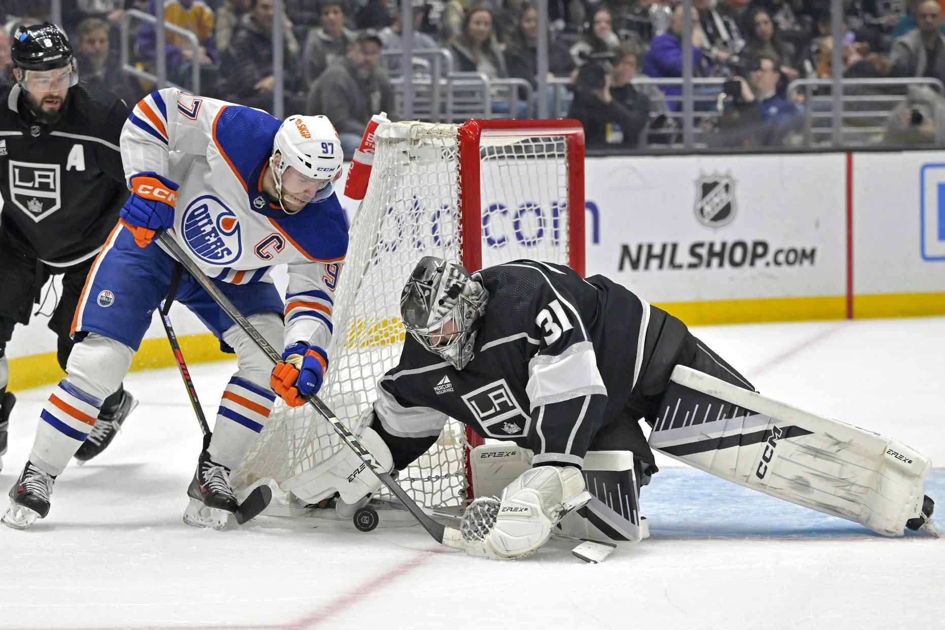
20 years ago today, Edmonton Oilers unveil McFarlane jersey


By Zach Laing
2 years agoIt was 20 years ago today that the Edmonton Oilers unveiled their legendary 3rd jersey that took the hockey world by storm.
Dubbed the McFarlene jersey, or the Oil Drop jersey, or the Spawn jersey, it took Edmonton by storm and became a fan favourite for years after being designed by Canadian comic book creator Todd McFarlane. Two decades later, the legend of the jersey continues to live on with fans asking for its return.
As a kid who grew up with a dad who is the biggest Oilers fan I still know, the Oilers were the top dogs in my house growing up. So much so that my first ever hockey jersey, given to me by my aunt, was a Tommy Salo Oil Drop jersey — one that I still hold near and dear to me.
Here’s what Edmonton Journal fashion writer Jean Fraser said at the time of its release:
Just how long it will take die-hard sports fans to get used to the Edmonton Oilers’ new-look jersey is anyone’s guess.But the lace-up retro detail, silver-navy colour mix and hip-hop sensibility mark it a winner from a fashion point of view.Designed by the superstar creative team of Todd McFarlane and Brent Ashe, with a generous nod to skateboard chic, the oversize jersey has rap-star appeal, Gen-X allure and will work as well on urban streets as it does on hockey ice.Which is exactly the point, says the Calgary-born McFarlane, modern and sophisticated in head-to-toe black and a pair of Gucci-style shoes.“We wanted it to be a hockey jersey but also a good wear if you were just walking down the street.”The brains behind Spawn, a comic book so successful it reportedly outsells Batman and Superman five to one, McFarlane was in Edmonton to help the Oilers organization launch the team’s new jersey inside the futuristic Odyssium dome, a jersey that will be worn on ice just 13 times this season.Part Las Vegas kitsch, part Star Wars, the pink-tinted venue was perfect as a backdrop for the promotional pitch that kicked off the jersey’s preview.First, there was a video. Slightly cartoonish but appropriately high-tech, it was produced by Aquila Production’s talented Don Metz.The video had a surround-sound track that rivaled 2001: A Space Odyssey for impact, a Gord Marriot voice-over worthy of Darth Vader and an informative story line outlining the reasons behind the design of the team’s so-called Third Jersey. (Think of it as the sports equivalent of a tuxedo, a dress-up counterpart to the standard jerseys worn at home and away games.)Readers can get their first glimpse of it in action tonight when the Oilers play Vancouver.They can pick up a semi-pro one of their own at Champions for $110 or spring for the real thing, on-ice straps and all, for $250.Regardless of how often it is worn, the jersey’s hot new look sends an unmistakable message that the Oilers organization, like everyone else, is trying to capture the attention of the fickle 18-to-30-year-old demographic. A good way to do that is offer up a wearable fashion item that meets the twin goals of advertising your team while sporting something with gold medal design stamped all over it.That’s what McFarlane/Ashe delivered.“I used to work at Planet X in Vancouver so I’m pretty familiar with the appeal of skater fashion,” explains Ashe, every inch the hip young modern dressed in a right-now BCBG shirt with hot-off-the-runway hidden buttons.“I really like what Mark Ecko is doing with Ecko, for instance, the urban hip-hop feel it has to it. Diesel is cool, too, and that kind of cool is what we were after. But the one thing we really wanted was to keep it simple, keep it clean, with a logo that would not look gaudy yet would not be overshadowed by anything else.”“And one that would look as good in motion as it does standing still,” adds McFarlane. “We really had to consider that angle. Hockey players are in constant motion, often seen through a camera lens from far away. People want to be able to see the name and the logo so you want to stay away from anything cartoonish.“Just keep the elements simple was the approach we took.”Commenting on the McFarlane/Ashe update to the venerable Oiler jersey he once wore so proudly himself, Oilers general manager Kevin Lowe admitted, albeit grudgingly, that maybe it was time for a change.“There is no question the jersey is geared to the young,” he says while eyeing Oiler captain Jason Smith modeling one on the venue’s makeshift runway. “We have to make sure we don’t lose them.”For his part, the 28-year-old Smith says he likes the colours, thinks the silver crest is great and is happy that the styling is simple.Not only that, he says, “that other jersey is 25 years old. This is new. It’s a change that fits in with the times.”Sharp, blade-like shapes signify the blades of a hockey skate.The five rivets around the oil drop represent the five Stanley Cups won by the Oilers.Inner and outer gear shapes signify force and reinforce the concept of teamwork and industriousness.The oil drop is derived from the original logo. It’s turned on its side to suggest speed in the new logo and it has been given a highlight to emphasize the difference from the original.
Zach Laing is the Nation Network’s news director and senior columnist. He can be followed on Twitter at @zjlaing, or reached by email at zach@oilersnation.com.
Recent articles from Zach Laing