Nation Sites
The Nation Network
OilersNation has no direct affiliation to the Edmonton Oilers, Oilers Entertainment Group, NHL, or NHLPA
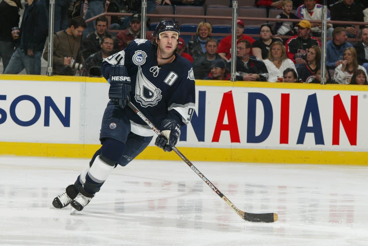
That Spawn Jersey

Photo credit: Edmonton Oilers
Oct 26, 2021, 14:45 EDTUpdated: Oct 26, 2021, 18:36 EDT
So, it’s been 20 years today since the Edmonton Oilers unveiled the first third jersey in franchise history. As I recall, it was Ryan Smyth, Mike Grier, captain Jason Smith and Rem Murray who gave us the first look at what became known as the Spawn jersey on Oct. 26, 2001.
It was designed by Todd McFarlane, creator of the red-hot Spawn franchise, who’d joined the Oilers’ vast ownership group known simply as the EIG in the era before the salary cap and Daryl Katz came along, and creative partner Brent Ashe. It was an eyeball-grabber, a total departure in color and design from previous team silks.
I’m not sure old school Oilers’ fans cared for it was much as younger fans did, but it wasn’t designed for the crowd that had been around for all those Stanley Cup parades. Sure, the five lugs on the front logo and shoulder patches paid homage to Edmonton’s five Cup wins, but the design was out-of-the-box edgy — and timely.
At a time when every dollar mattered to the EIG, the Spawn jersey sold like hot cakes. Profits from sales of the new silks went right to the team’s bottom line. “The jersey broke NHL records for third jersey sales for number of units and dollars sold,” said former Oilers’ president Patrick Laforge. “As we hoped, it was a hit with Todd’s followers as well.”
TIMELY CONCEPT

“I saw some of the early designs on it,” said McFarlane, who was one of the last investors to join the EIG. “It was like uughhhh. I mean, it was goofy, silly . . . I wanted to design something that, even if you knew nothing about sports, even if you knew nothing about hockey, you could still look at it and go, ‘I don’t know what it is, but it’s pretty rad.’
“You could walk down the street with it. That’s it. That’s all. That’s how simple I think logos should be. It was a best-selling third jersey. It set records, so God bless Edmonton . . . a strong logo is a logo that anybody will wear, regardless of the sport. When you look at the wheel and that wing for the Detroit Red Wings, it doesn’t say hockey. The Boston Bruins is a B with spokes on it. It’s just a classic, cool look.”
McFarlane’s design was so popular, Jean Fraser, the fashion editor at the Edmonton Journal back in 2001, wrote piece about it under the headline, “Skateboard chic – for $250.” I’ve still got a signed Mike Comrie No. 89 jersey from the era. To be honest, while I liked the blue and silver in the jersey, I never cared for the front logo or the shoulder patches. You?
Back then, in the years before Twitter and social media, the unveiling of a third jersey was a big deal. As you’d expect, the Oilers kept everything about it under wraps, which was a lot easier to do. McFarlane was living in the Phoenix area and I’d arranged to meet him to have a quick look at it – camera in hand — and do an interview months before the unveiling, but I blew it.
With the team bus rolling into Phoenix from Sky Harbor, I called McFarlane to let him know we’d landed and that I’d call him later to arrange a get-together. Perfect. Well, not so fast, Rueben. Team media man Bill Tuele got wind of it – I’m guessing, “Hey, Todd, we’re here” – tipped him off and that was that. I had to wait until Oct. 26 like everybody else.
It was a smash with fans, and that’s all that mattered.
Previously by Robin Brownlee
Recent articles from Robin Brownlee
Breaking News
- Bruce Cassidy: Coaching a Canadian team to a Stanley Cup would be ‘cool’
- The Verklempt Variety Report: Oilers down to the Ducks, the Chump of the Week, and the panel
- NHL Notebook: Tkachuk’s future questionable in Ottawa, Celebrini and McKenna join Canada at Worlds, and the end for Kopitar
- ‘The NHL has a very serious officiating problem’: Fans split on controversial overtime goal ending Game 4 between Ducks and Oilers
- 10 thoughts on the Oilers Game 4 loss
