


Now that the Reverse Retro jersey design has been officially unveiled, I took the time to gather a few first impressions from around Oilersnation. The much-anticipated return of the oil drop has mixed feelings from social media comments. Let’s see what you had to say!
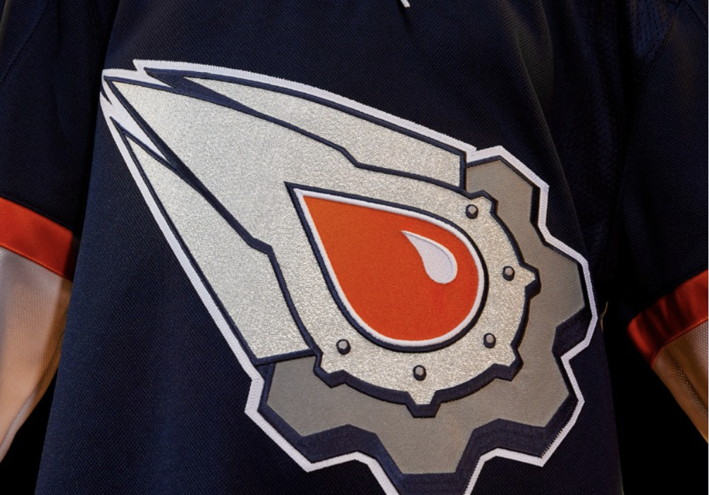
The colour choice has been one of the issues that fans have said about the reverse retro. I will agree that the orange in the middle does feel a little much. It’s like the saying goes, “if it ain’t broke, don’t fix it” which seems to be the best way, to sum up, the reaction toward the jersey.
I feel like the orange and blue they picked just dont get well. Something is off. Maybe they will look better in person but so far its a miss.
— Father Of 4 | R.I.P Pat Stay💐 (@Father_Of4TTV) October 22, 2022
Is the orange too much for the oil drop? It feels like if they left the middle untouched, left it as blue then more people would’ve been happier. The orange seems to work well on the arms, but the oil drop? Not so sure if it works.
I never understood why the oil drop went from blue to orange.
— R C K (@RickKraal) October 22, 2022
The more I see the comparisons to a yolk, the more I can’t un-see it. It’s oddly noticeable and probably a good reason why they should’ve not gone with orange. Would we be surprised if Gene Principe ends up making a few puns with the jersey? I can already hear him saying “They look egg-tastic on the ice” or maybe I’m just crazy.
I loved and own the original McFarlane Jersey, but I just can’t not see this. pic.twitter.com/e3FwjX2VQe
— Whither The Avro Arrow? 🇨🇦 (@yegbanya) October 22, 2022
This is the perspective I’m going with: “Sometimes these things look better on the ice,” but that could be tough to judge with all the promotional content. Honestly, can’t wait to see the players wearing them. It’ll feel different for sure when they wear them for the first time. We haven’t seen the Oilers wear a different logo as well in over 10+ years now!


Here we have another comparison to a fried egg. Now if they made a white version that would’ve looked CLEAN and we have seen mock versions of that over social media before.

TikTok
We have a positive comment! There’s a little more love for the reverse retro over on TikTok! And if there’s any criticism to be found, it’s toward the oil drop.

Now, this is the most positive comment I’ve found. Adam even likes the orange oil drop! And it’s okay if you don’t like the jersey of course, and it’s okay if you love it as well! Just like how I started the article, many mixed reviews with the reverse retro.

“If you don’t like the orange, you simply don’t respect the history of the orange.” Now that is a COMMENT. I feel fans might be getting tired of the colour orange being forced in their faces. Blue, on the other hand, is a colour no one can hate. Is it odd to say that I wouldn’t care for orange if I wasn’t an Oilers fan? I respect this take though. Orange is an important part of this franchise but does it have to be everywhere?

Give us your first impressions on the reverse retro! Will you make a purchase? Personally, I don’t mind the jersey. It’s not entirely what I wanted either but I’m just happy to see the oil drop make a modern return! Can’t wait to see Connor flying in it!
