WWYDW: Alternate Jerseys

By Cam Lewis
6 years agoOver the past few weeks, I’ve asked Oilersnation about depth forwards, defencemen, and how best to optimize the team’s superstars. Currently, the website is overflowing with discussions about how best to handle Kailer Yamamoto this year and the hot issue of athletes and politics.
So for this week’s What Would You Do Wednesday, I want to go in a completely different direction and ask everyone what the Oilers should do when it comes to an alternate jersey?
The league partnered with Adidas for a brand-new batch of sweaters this year, but nobody has a third jersey yet. Should they keep it this way? Is there any purpose in having third jerseys that get worn occasionally? Should the Oilers bring back the spawn logo of the mid-2000s? Or should they go in a completely new direction?
The Oilers rocked these iconic orange and blue jerseys when they entered the league in 1979 and stuck with them until the mid-1990s. There were minor changes made along the way to the numbers on the back and the logo, but the general concept remained the same. These are the colours associated with the glory days. All five of the Oilers Stanley Cups were worn wearing these colours and all the legendary photos of Gretzky, Messier, Kurri, Fuhr, and Co. feature them. Beyond the good memories, this is also an objectively nice colour scheme.


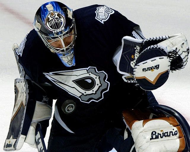
Then, in 1996-97, the Oilers pivoted to a new colour scheme. It involved moving from the orange and blue colours to a midnight blue and copper with a red trim, though the logo remained largely the same. The Oilers also implemented a brand-new alternate logo, as the “Rigger” showed up on the shoulders of the jersey. This is the colour scheme the Oilers rolled with until 2010-11, with some slight changes along the way. They made a pretty major change in 2007-08 for the league’s shift from CCM to Reebok, moving to these terrible practice jerseys that looked like pyjamas.
The midnight blue and copper themes jerseys are what a person born in 1993 like myself associates with their childhood Oilers, while an older person would associate them with dark, unpredictable days of the mid-1990s. I think most people would associate these colours with gritty Oilers teams that weren’t all that skilled but were hard to play against. The best memories from these jerseys, of course, was the 2006 Stanley Cup Final run.


In 2001, the Oilers went completely off the grid and introduced their first-ever alternate jersey. This logo was designed by Todd McFarlane, who, at the time, was a minority owner of the team with the Edmonton Investor’s Group. This thing is incredibly polarizing. Many view it as corny and emblematic of the movement towards cartoony jerseys during the league’s expansion in the 90s, while others enjoy it for being sleek and unique. It was the first jersey I ever owned as a kid so I have a soft spot for it, though I do agree it pretty corny and strays ridiculously far away from the general idea of what the Oilers are doing with their colour schemes. These lasted until the team switched to Rebook jerseys in 2007-08.

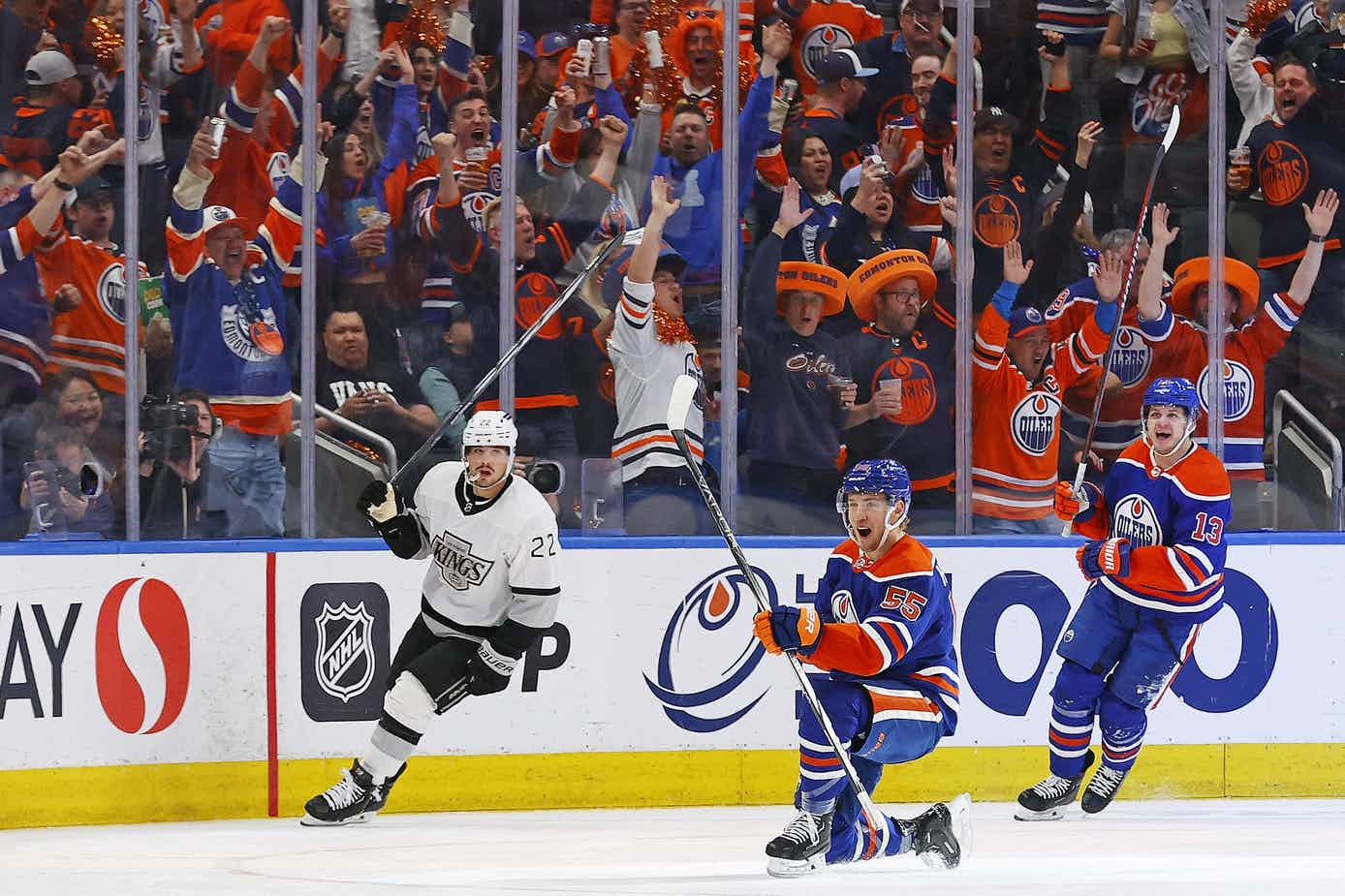
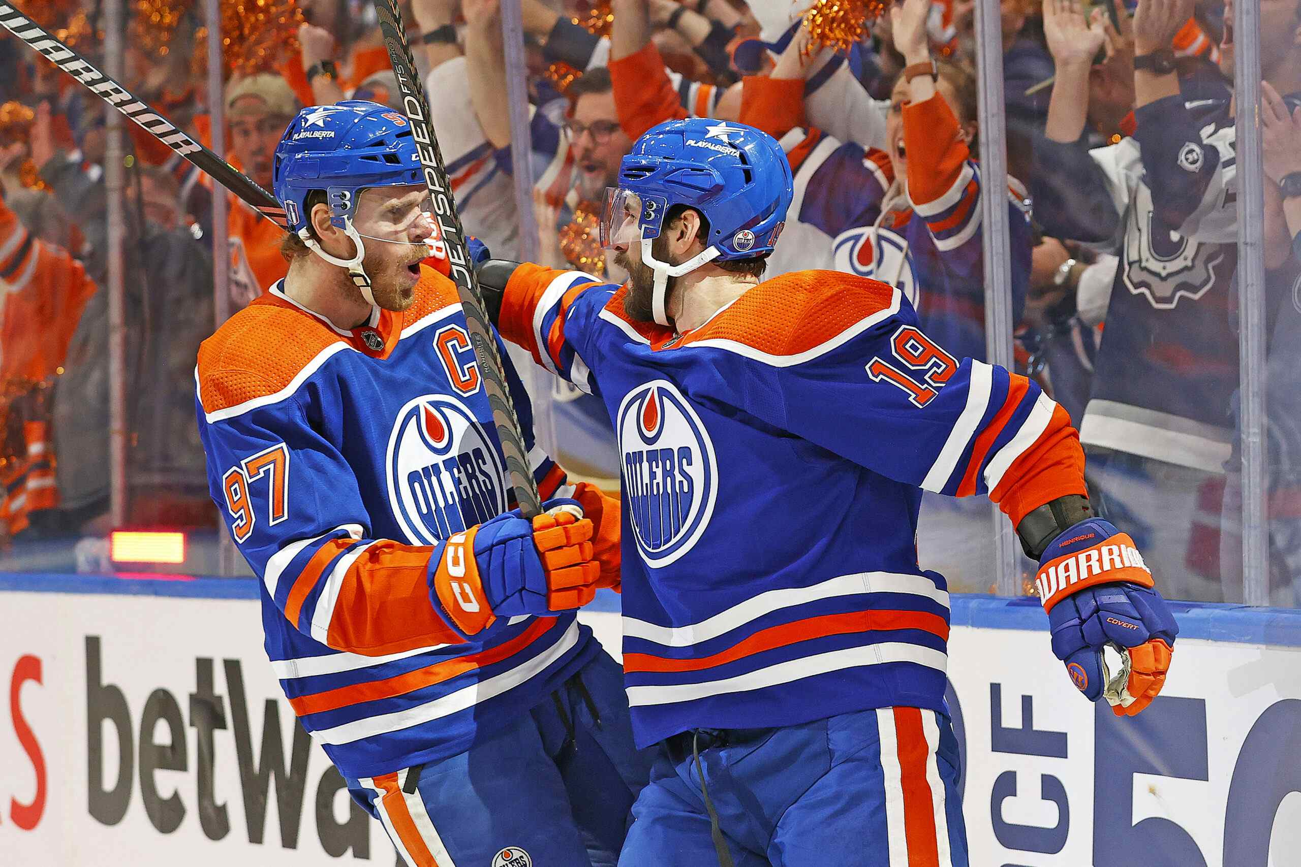
In 2008-09, the Oilers circled back to the good old days with a return to the orange and blue jerseys as an alternate. These were so so sooooo much better than the damn pyjamas they were rocking otherwise, so in 2011-12, they made both their home and away sets orange and blue designs. In 2015-16, the Oilers introduced an alternate jersey with an orange body, a homage to their WHA days in the 70s. When the league pivoted to Adidas this year, those orange jerseys became the home set.


Back to the question… What should the Oilers do about their alternate jerseys moving forward?
Should they go in a new direction while also keeping in mind the history of the 2000s?

Should they go all the way back to the metallic sperm?

Maybe stick with the same colour scheme but go the classic handwritten font route?

Or mix a blend of new and old and finally give the good ol’ Rigger a chance to shine?

Maybe they can do something to go along with the Green and Gold colours of the city, as we see the Eskimos and Golden Bears wear.

What do you think? Should they bother with a third jersey? If they do, should it be in line with what they already have, the orange and blue scheme, a homage to the midnight blue of the gritty days, or should it be totally off the grid and in a new direction?
Recent articles from Cam Lewis