Speaking of… The Best and Worst NHL Jerseys
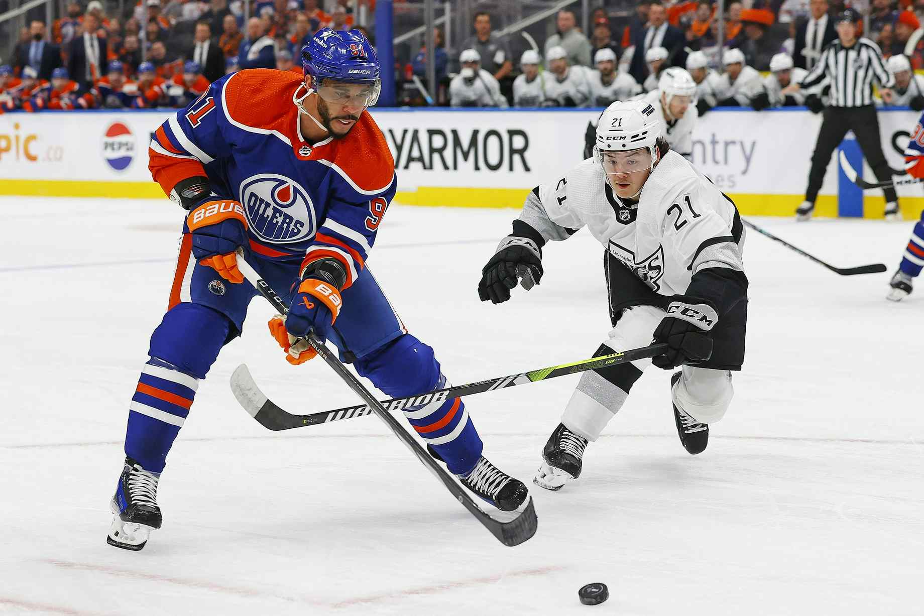
A heated debate erupted at Nation HQ yesterday afternoon when Baggedmilk commented on how bad the Nashville Predators home jersey looked. I disagreed (I think he’s crazy), and, personally, really like the gold/navy/yellow combination. Anyways, this turned into a long-winded conversation about how bad some jerseys in the NHL currently look, and how bad some have looked in the past.
Now, I want to turn the debate over to you fine citizens. Through the power of this beautiful poll, I am curious about what the Nation feels is the best and worst looking jersey in the NHL.
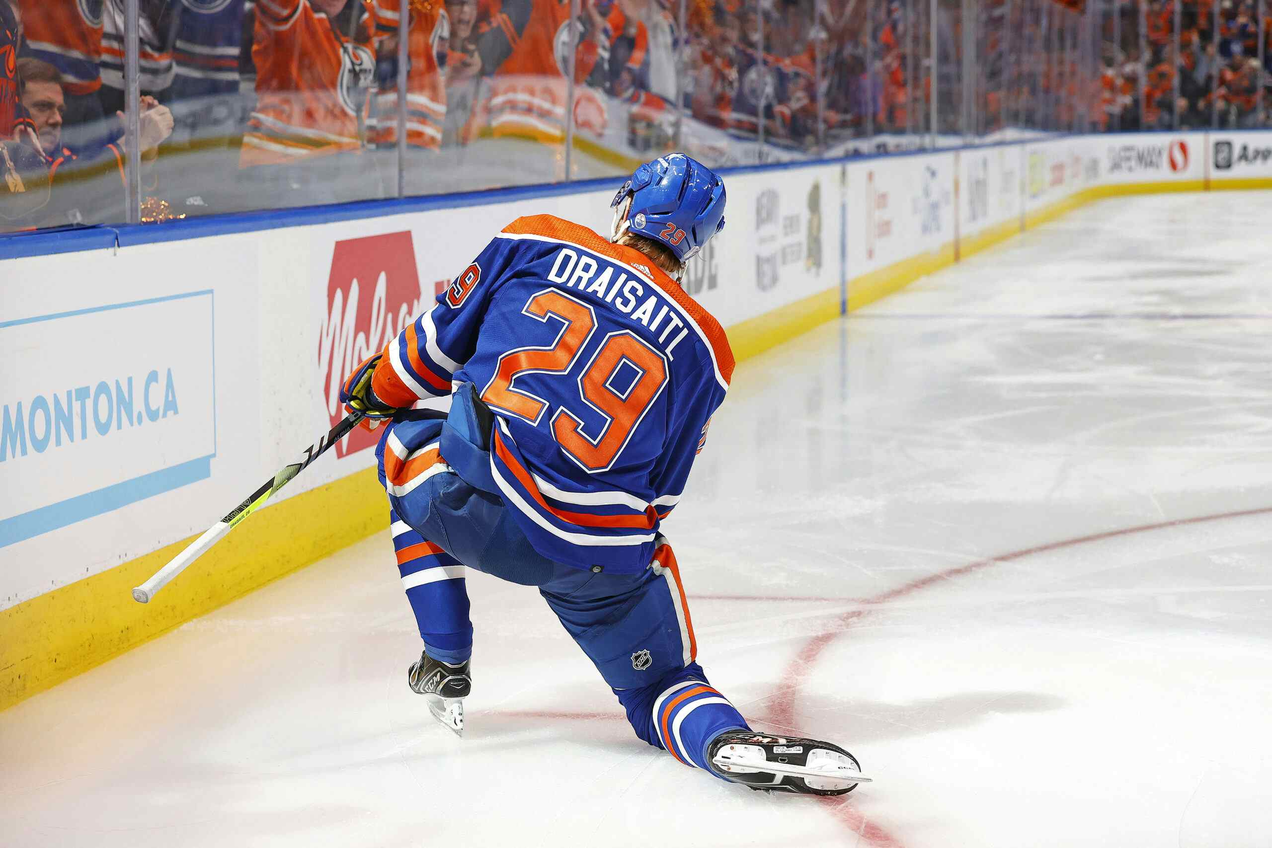
I personally love the Oilers jersey – cause I’m super biased obviously – and the Nashville jerseys. This may be an unpopular opinion also, but I love the handwritten logo jersey’s like Calgary’s third, or Minnesota’s third (besides the colours). Unfortunately I didn’t want to spend six weeks adding every jersey in the history of jerseys on to this poll, so if there’s a third jersey you like, let me know in the comments. So good luck, be safe, and enjoy the poll.
North x NorthGretz
This week the boys are joined once again by the host Inside Sports on 630 CHED, Reid Wilkins! Reid and the boys talk about the upcoming 2016-17 Oilers, Reid’s journey throughout his radio career, Mick Jagger’s sexual habits, the best high school football game in Lloydminster history, and Reid recites a poem for Chris The Intern before another rousing edition of Ask The Idiots!
As always you can follow North x NorthGretz on Facebook, Twitter and Instagram, and subscribe to the podcast on iTunes and Google Play!
PREVIOUS EPISODES
- Episode 28 – Wasp Attack!
- Episode 29 – Bum Corn
- Episode 30 – Ball Water
- Episode 31 – Kyla’s Mom
- Episode 32 – R.I.P Nexopia
- Episode 33 – The Mark Spector Show
- Episode 34 – Stanley Cup Winner Justin Schultz
- Episode 35 – Pre Draft Spectacular!
- Episode 36 – Goodbye, Taylor Hall
- Episode 37 – Rough Ryder
Recent articles from Chris the intern


