Worst to First Jerseys: The Edmonton Oilers

11 years ago

This installment of the Worst to First Jerseys features the Edmonton Oilers, and much thanks to Oilers Nation for letting me guest post on their blog. On my own blog, I talk about about graphic design in hockey and I’ll be doing the rest of the league over time, so come by Hockey By Design to check it out.
By John van der Woude
The Oilers are the epitome are consistency in a league that tends to treat design like a revolving door: easy come, easy go. Aside from the Original 6 teams, only Philadelphia and St. Louis have kept essentially the same logo since the Oilers joined the league in 1979. (Pittsburgh, Buffalo and the NY Islanders have all gone back to their circa 1979 logos, but not before dabbling with other atrocities.) And the Oilers’ jerseys have remained admirably consistent as well.
Here’s how this works: I’ll count down, from worst to first, all the jerseys the Oilers have ever worn. Homes and aways will be lumped into the same category (so, more of a jersey "era") and I won’t worry about small changes (like slightly changed positions of piping for example). Third jerseys will stand on their own. And I’m focusing on the jerseys only, not the entire uniform. The jersey images are compliments of the fine people over at nhluniforms.com. For the Oilers, there’s 4 different jerseys/eras. And we’ll start with the worst one:
4. 2001–2007 Third Jerseys

I respect Todd McFarlane. I really do. He’s an accomplished artist, cartoonist, writer and business person, achieving more than I probably ever well. But of all the things he is, one of them is not a graphic designer, and while his alternate logo that graced the Oilers’ third jerseys is well-constructed, it’s such a departure from the legacy of the Oilers that it’s hard to not say it pales in comparison (I ranked the Oilers at #11 for the best team logos in the NHL, which you can read about here).
I know the legacy is built into this logo with the 5 gears representing the 5 Cups they’ve won, but you’ve basically got to re-design this logo whenever the team wins another Stanley Cup. To me, it says, "Well, we’re not winning another one anytime soon, so we’re safe to keep this logo going." The Islanders do a similar thing, but the integration is much simpler and subtle and not as integral to the overall design. This post, though, isn’t about logos, but about jerseys and I have no idea how much input McFarlane had in the design of this one.
I’ve stated numerous times on my blog how difficult it can be to disconnect legacy and heritage from a cold analysis of the design of a logo or jersey, and this is one of those instances. In the mid-’80s, Glen Sather assembled what is arguably the best teams to have ever existed in the NHL, winning 5 Stanley Cups with 6 of the players from those teams sitting in the Hall of Fame. So, that logo, that jersey, that era, is almost holy. And this third jersey threw that all away.
That being said, outside of that context, these are not bad jerseys, and a valiant effort to forge a new identity for the Oilers that, at the point these jerseys were worn, were over a decade removed from those glory days. True, they had a run in 2006, but anybody except for the most delirious Edmonton homers who tell you that such a run was completely expected should be psychologically evaluated. If you ignore all history of the dynasty years, these jerseys are pretty solid but not without some things to complain about.
The best thing about this jersey is the simplicity and minimalism of it. The piping is simple but strong, complementing the jersey and the logo rather than overtaking it. I’ve always been a fan of including lacing at the collar, giving it a instant sense of history and legacy.
But the biggest complains about this jersey comes down to a pet peeve of mine, a blue so dark that it becomes almost black, which then begs the question, why even bother? The Oilers are by no means the only team guilty of this, with Buffalo, Columbus, Florida, St. Louis and Winnipeg all doing the same thing in this past season alone. I’m not against using a dark blue, but just lighten it up enough that it’s obvious that it’s a dark blue.
What the dark blue also does is also make these jerseys a combination of almost-black/grey/white, lacking in any sort of visual punch anywhere. I’ve never liked that on the LA Kings, and I don’t like it here either, especially when you have such an awesome blank canvas like a white sheet of ice to work with. Colours work so great with hockey that it doesn’t make sense to essentially not include any.
This is also the first and only time the Oilers played with using a font on their jerseys other than the angled-off block font that’s a sports staple. I commend the effort in trying something different and wish more teams would play around with this, but it’s a bit of a miss, looking more like a oddly squished Game of Thrones-esque font. Meh.
Jersey Recommendation: #83 Hemsky – A great player with lots of skill, but either because of injuries or other issues, has never really lived up to expectations. Kind of like McFarlane and this logo/jersey.
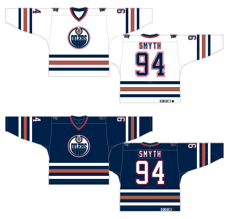
3. 1996–2007 Home and Away Jerseys
As I mentioned earlier, there’s a large amount of consistency with the Oilers’ jerseys, so the rest of this post will be nit-picking about details. But, as they say, the devil is in the details. And I think Todd McFarlane would agree with me.
To be honest, I could rank the previous jersey as #2, and the rest as #1a, 1b and 1c as there’s good and bad things about all of them, but nobody likes a tie game anymore.
This jersey represents what was the first re-branding in the Oilers’ history in the NHL. And the re-branding was very slight. The royal blue became a darker midnight blue, the orange became copper and a little touch of red accent was added. Otherwise, everything remained almost exactly the same from the jerseys that preceded it. I think the copper was a great choice and works well with the name. I’m not sure how much copper has to do with oil drilling, but there’s an industrial metaphor that works there. And it’s a unique color within the design world of the NHL. But, you can probably guess by now how I feel about the midnight blue.
Like a badly-lit photograph, it’s too dark. When on the ice, it’s almost completely black and is not taking full advantage of the aesthetics of hockey. Like Charlie Brown, it needs to brighten up.
As for the red, I don’t think its inclusion is totally necessary and I’m not crazy about its use on the numbers/name plates. It’s not horrible, and works better on the dark blue jerseys because it’s fairly subdued against the blue, but it’s less successful on the white jerseys.
The piping along the bottom and sleeves on these jerseys are exactly the same as during the Oilers’ dynasty days and are classic hockey jersey piping. Nothing wrong with a solid design that works like that. They’re simple and off-set the logo just fine. Maybe they’re a little bit too dominant on the jersey, and again, the additional red stripes on the copper stripe is totally unnecessary.
In the first year of these jerseys, that had additional blue shoulder yokes on the home jersey. Thankfully, that only lasted one season.
Jersey Recommendation: #94 Smyth – The heart and soul of the Oilers during these years, and the undisputed leader of the team during its 2006 Cup run.
2. 2007-2011 Home and Away Jerseys, 2011-present Third Jerseys

For these jerseys, you can pretty much re-read what I wrote about the previous jersey regarding the colours, so I won’t bother talking about that again in this section. To sum up: cooper = Great!, blue = Too dark!, red = Meh.
But the piping design of these jerseys is totally different from anything else the Oilers have had, the main reason for this being that they went for a re-design when the NHL introduced the Reebok Edge jerseys in 2007. At that point, some teams just kept the same design and made it work with the new shape, some teams took the opportunity to redeisgn their jerseys to complement the new shape, and some teams decided to radically change the traditional idea of hockey jersey piping and trace the new contours of the jersey with colour. The Oilers fell into that last category, and for the most part, they did so successfully.
A few teams went for the vertical piping from the base of the jersey to the collar, tracing a contour of the new jersey’s design. I like the contemporary minimalism of it, like the hockey jersey suddenly got all refined and grownup – like the opposite of BizNasty. And it’s much better than what the Oilers’ hockey cousins to the south did with theirs, making it look like a barley-cooked spaghetti strand.
But the piping on the sleeves bug me. I don’t mind the actual structure of the piping, with the thin white stripes and thicker copper stripe (but the red is still unnecessary), but I have no idea why they didn’t just wrap it around the entire arm or why they gave it that wave-like thing, going thicker and thinner in different parts. That’s a bit of a miss.
That being said, it’s a great-looking, contemporary hockey jersey. Wear it with pride.
Jersey Recommendation: With the new era of Oilers hockey about to get going, you’ve got a whole list of people you put on this jersey. A #4 Hall? Yes. A #93 Nugent-Hopkins? Sure. A #14 Eberle? Why not. A #64 Yakupov? Go for it, but make sure that will be his actual number with the Oilers first. But since they’re moving away from these jerseys (except as thirds), might be better to go for a #10 Horcoff?
1. 1979-1996 Home and Away Jerseys, 2003 Heritage Classic Jersey, 2008-2011 Third Jerseys, 2011-present Home and Away Jerseys
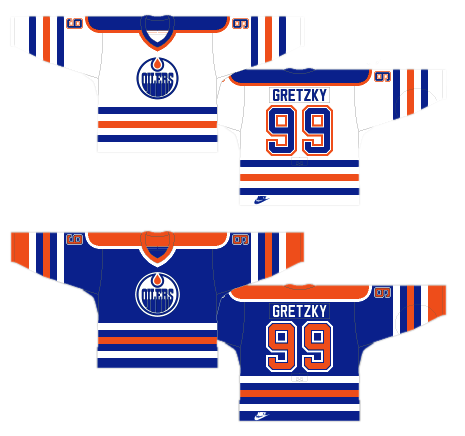
Remember what I was saying earlier about separating legacy and history from the cold analysis of a design? Well, the difficulty of doing such a thing may have influenced the decision to place these at #1. But it’s easy, as a fan of any hockey team, to see the intrinsic value of a jersey that raised not just 1 Stanley Cup in, but 5. These jerseys are pretty abrasive and even gaudy, but there’s a reason the Oilers’ organization keeps coming back to them: It’s a symbol of success, and seeing all those #1 picks that the Oilers have gotten in recent years skating around in these jerseys makes you believe that success is again right around the corner.
And this royal blue is a hundred times better, because it actually looks like blue as opposed to light-blackish blue. It automatically makes the jersey bolder and more aggressive on the ice. The orange is, for those who know a little colour theory, the complementary colour to blue, so they highlight each other well. But too much of each colour, and they’ll start competing against each other instead. In the case of these jerseys, they’re well balanced though.
The piping is, like I said about the #3 ranked jersey, are solid classic hockey jersey piping. Unlike those jerseys though, it comes across as much more aggressive here because the orange (as opposed to the copper) stands out much more. That’s good and bad, as the piping becomes pretty dominant on these jerseys (and like a a little gaudy) and could be pulled back just a little bit by either making the stripes slightly narrow, or have less of a gap between the stripes, or both. Primarily, you want the jersey to really compliment the logo, and it’s starting to take over the logo a bit in this case.
Part of the problem too are the colour bars on the shoulders, which also compete with the logo. They’re really unnecessary and could be removed, as they did with the 1996-2007 jerseys.
There’s serious complementing (not complimenting) that needs to happen in a jersey, and this jersey has just enough of that. However, once you factor in the history and legacy attached to this jersey, it’s just too much to not place (barely) in first place over all the previous jerseys.
Jersey Recommendation: You could put the names of the entire rosters from the ’80s teams and the most current rosters and make an argument for getting a jersey with their name and number on it (well, almost everyone). Some of the most iconic players to ever play the game wore this jersey, as well as some serious upcoming superstars. Me? I’d rock out the #17 Kurri, in what was the home whites at the time.
Editor’s note: John van der Woude previously wrote a similar piece at Flames Nation featuring Calgary’s best and worst jerseys – JW.
Recent articles from Jonathan Willis