Brewed with #OilCountry passion. Introducing the #Oilers adidas #ReverseRetro jersey. Hitting the ice in 2021.
Nation Sites
The Nation Network
OilersNation has no direct affiliation to the Edmonton Oilers, Oilers Entertainment Group, NHL, or NHLPA
The NHL’s reverse retro jerseys are here!
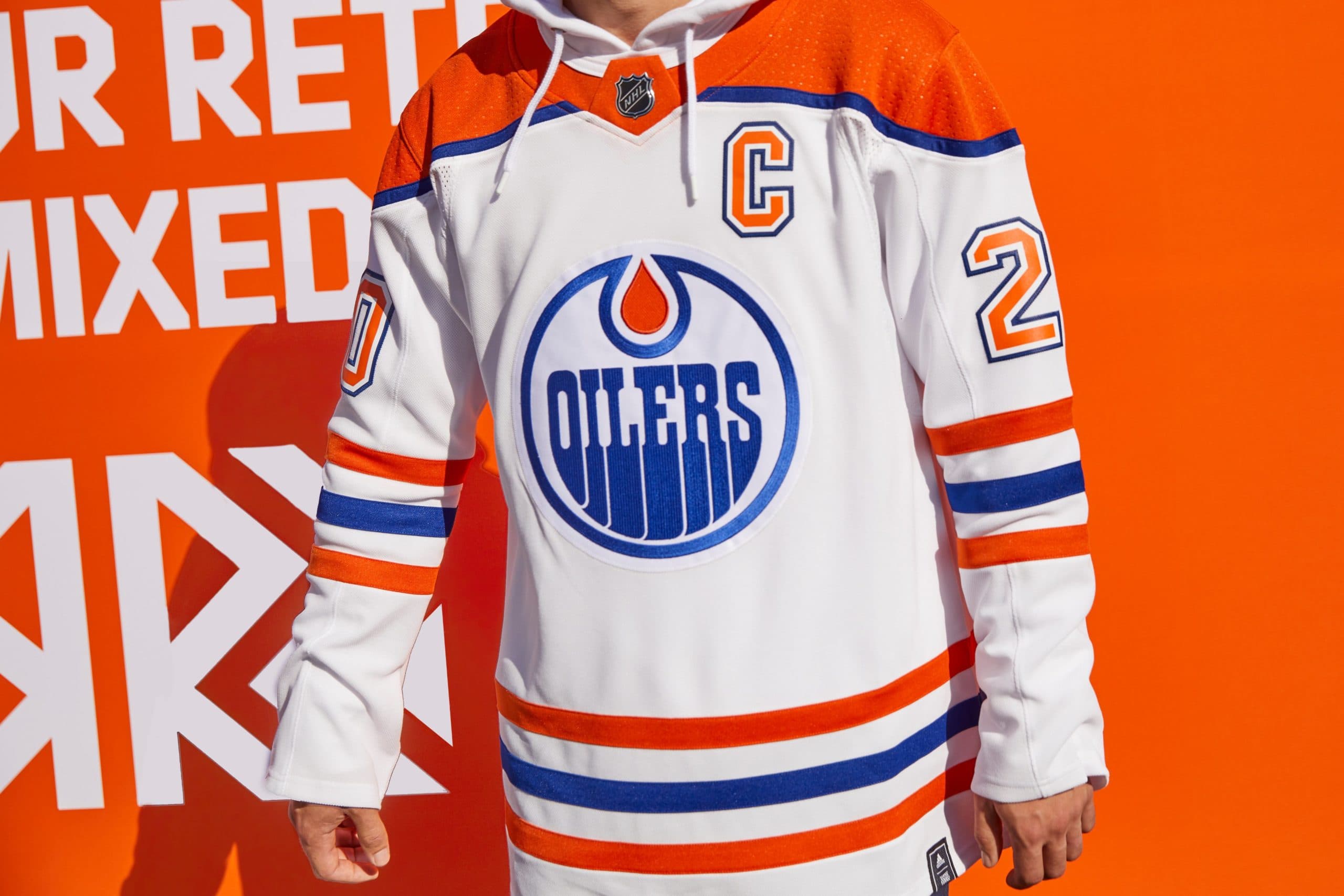
Photo credit: NHL.com
By baggedmilk
Nov 16, 2020, 18:45 ESTUpdated: Nov 16, 2020, 19:06 EST
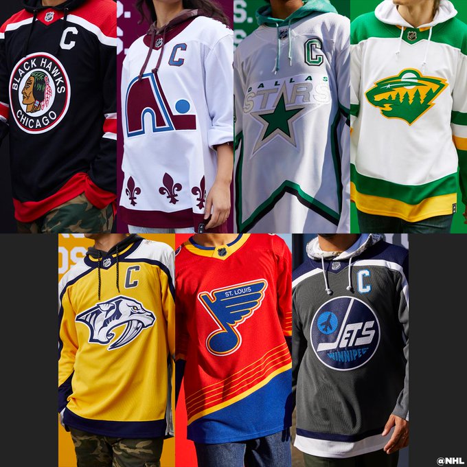
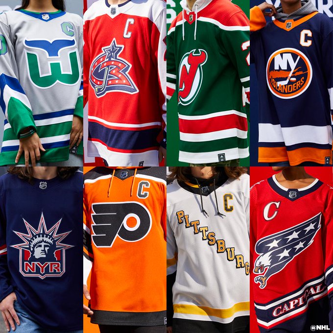
This morning, the NHL finally revealed all of the reverse retro jerseys its 31 teams and I wanted to take a few minutes to break down some of the best and worst of the bunch. Join me, won’t you?
To start things off, I want to look at the Oilers jersey to start. Personally, I will always love anything with the Oilers logo on the front of it, and I do think these new unis look really sharp with this reversed colour scheme. Frankly, I can already picture myself rocking a brand new Nugent-Hopkins retro jersey and drawing the yearnful eyes of both men and women alike — it’s a good look and I’m going to have to be careful to not get all of you pregnant. If I was going to complain, it would be because it’s another safe uniform for the Oilers to release and while I do agree that this throwback to the WHA days is dope as hell, I don’t exactly think it’s all that creative either. Will I buy one? Probably, but I do really want to see the Oilers come out with something unique for a change. Maybe next year?
THE BEST…
Forum Blue and Gold reigns again. Introducing the LA Kings adidas #ReverseRetro jersey. Hitting the ice in 2021.
Outside of the Oilers jersey, I think my favourite retro design has to go to the Los Angeles Kings for pulling out the old purple and yellow that they used to rock back in the day. Yeah, we all know that the Lakers still wear these colours but I have to say that the old Kings unis were just as sweet, so I was pretty pumped to see them going back to this combination. As much as I hate the Kings and hope that they never win another game in the franchise’s existence, I do think they will look pretty sharp losing in these retro jerseys.
Cue up Brass Bonanza. Introducing the #Canes adidas #ReverseRetro jersey. Hitting the ice in 2021
I’ve always loved the Hartford Whalers jerseys and it made me happy to see that the Hurricanes were bringing them back. That said, I do wonder how the people of Hartford feel about this design seeing as their team was taken from them, and now they basically have to watch their ex-girlfriend parade around in a new city while looking hot as ever? Tough one for Hartford, but a big win for Carolina.
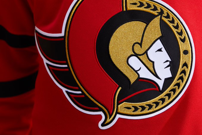
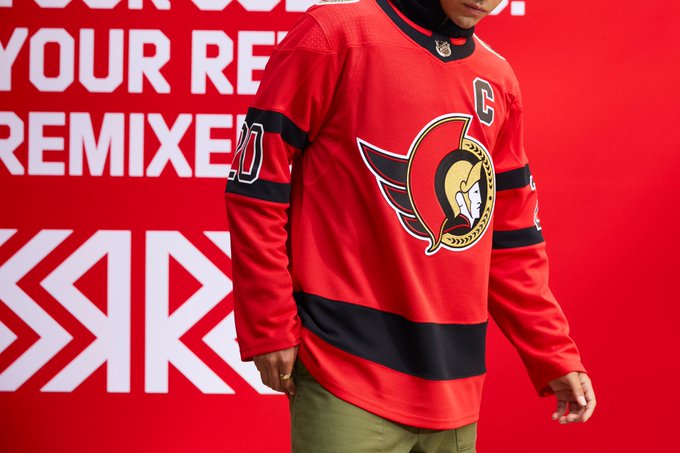
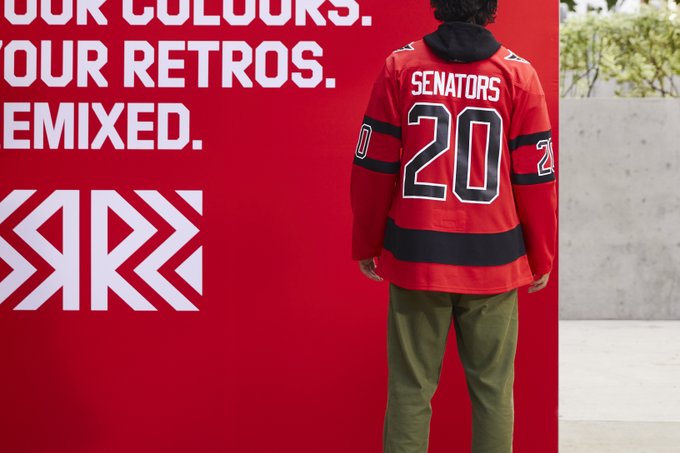
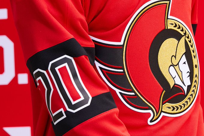
I think the Senators nailed it with their reverse retros in both colour scheme and logo design. I’ve always preferred the 2D logo so I liked seeing them go back to it, and I think the red body is going to look really solid on the ice. Overall, I would say that the Ottawa Senators new unis are easily one of the best to come out amongst the Canadian teams. Even though the team is going to be trash again next season, at least they’ll look good while they’re doing it.
THE WORST
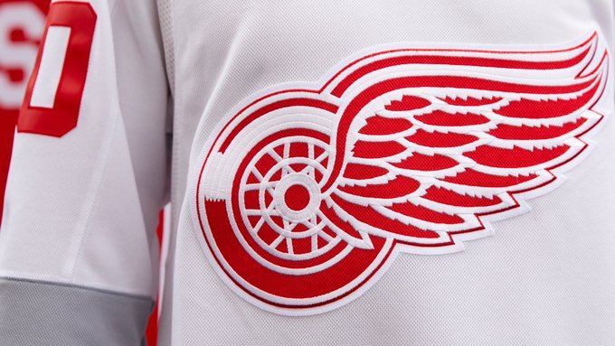
I’ll be honest, I legitimately burst out laughing when I saw the jerseys the Red Wings were putting out. To me, these “retro” jerseys look like they completely forgot that they were supposed to participate and hammered these out in five minutes just before the deadline. They kinda look like those cheap practice jerseys you can buy from Canadian Tire and not one that you’d be excited to get on Christmas morning. I mean, they literally took their normal logo and slapped it on an all-white jersey with a few hints of grey splashed on the arms and body, making this easily the worst of the bunch. They’re hilarious, but man, are they awful.
A reimagined classic from Canucks history. Introducing the @canucks adidas #ReverseRetro jersey. Hitting the ice in 2021.
These Canucks jerseys are SOOOOO bad. I mean, they had the black, flying skate uniforms there and ready to be brought back, but they decided to go with these weird ones instead? Maybe it’s just because I have an ingrained hatred for the Canucks, a bias that I’m fully prepared to admit here and now, but I personally think they could have done a lot better than this weird, blended water-colour type of vibe. These jerseys kinda remind me of Hypercolor shirts from the mid-90s. Anyone else remember those?
I know a lot of people like these jerseys by the Anaheim Ducks, but they honestly remind me of a sketch a kid would do instead of paying attention in social studies. With the Wild Wing logo already being one of the best in that franchise’s history, I’m confused why they didn’t just go back to the design that Gordon Bombay and the boys made everyone love back in the day.
WHAT SAY YOU?
Now that you've seen them all... Which #ReverseRetro jersey by @adidashockey is your favorite?
Now that you’ve had some time to pick your favourites, which teams do you think did the best job of coming up with something different or visually appealing? I know my list won’t be the same as yours, and I’m curious to hear what everyone thinks now that the days of teasing are done and the final products have been revealed.
Recent articles from baggedmilk
Breaking News
- Oilers injury update: Draisaitl to skate this week, playoff start status uncertain
- Oilers are ‘betting favourite’ to sign German free agent Veit Oswald
- NHL News: Another coaching change comes as Islanders swap Roy for DeBoer
- The Oilers depth players are making meaningful progress
- What should the Oilers’ line combinations look like with Draisaitl and Hyman injured?

